

Hello, Villagers! My marketing nerd heart is so full that I get to talk more about branding with you today. If you missed our first Seekerville post on the subject, you can click here to read more of the specifics on honing brand, audience, and strategy.
Today, we’re going to focus on visual branding, which includes the colors, imagery, typography, and other design aspects that help tell the story of what we write and what our audience can expect in our social media spaces.
To start, I’m going to lay a few easy ground rules. The possibilities for self-expression are as unique and numerous as fingerprints, but the most effective platforms:
 If you do an online search, there are plenty of color palates and wheels. When you find the ones that work for you, be sure to keep the HEX code for each color handy, which starts with a pound sign followed by six symbols (i.e. #99FFFF is a lovely teal color). This is a magical internet-friendly code that will produce the exact color in most programs and applications.
Now, incorporate them into your logo, business cards, and one-sheets. Put them in your newsletter, your social media graphics, and website. Use one, a few, or all of them, and readers will know they’re yours.
If you frequently post your own photos on social media, then using a distinct filter, lighting, or composition can also contribute to your visual branding. For example, if your content is poignant and introspective, then artsy, moody images with deeper saturation might complement it well. There are so many apps that can help make your photos unique (author Mary Weber, aka the Instagram Queen, has some wonderful tricks and techniques in her Instastories).
 The language of sans and serif might as well be Mandarin to me, but typography definitely contributes to the tone and personality of brand. The fonts you pick for your website and graphics largely depend on the software you use and the choices available therein. One of my favorite resources for inexpensive, gorgeous typefaces is CreativeMarket.com, which has a demo area that shows what sample text looks like before you buy it.
When making your choice, it’s important to ensure fonts are clean and legible across multiple browsers (and small phone screens, too), particularly if they’re for a blog post or another large body of text. While I’m a huge fan of a strategically placed accent fonts, too many fancy scripts or ornate flourishes can be distracting and unpleasing to the eye. So keep it simple, friends!
Say you want to do a Question of the Week post on your business Facebook page. You would find the correct size for Facebook (1200 x 630 pixels, according to SproutSocial.com), crop an on-brand, eye-catching image or solid-color background to that size, and overlay text and colors on it. Then the next time, all you’d have to do is open that saved template and change the question, adjusting the background and colors if you want to.
Does this sound like a foreign language to you? That’s okay. While I worked in PR for many years, I’m much more of a word-nerd copywriter whose hot mess graphic design offerings leave the real pros shaking their heads. So I encourage you to feel around in the dark until you get it, even if it means bumping your shins a couple of times.
Don’t be afraid to let that brilliant personality shine in your visual branding. And when in doubt, keep it clear, keep it simple, and keep it consistent. I have full faith in you!
 Laurie Tomlinson is the award-winning author of That’s When I Knew, With No Reservations, and The Long Game, currently featured in the Once Upon a Laugh collection. Her stories are fueled by faith, steaming mugs of tea, and her belief that life should be celebrated with cupcakes and extra sprinkles.
Find her on Facebook @AuthorLaurieTomlinson or her website, www.laurietomlinson.com.
More Visual Branding Resources:
● Gorgeous color palettes to inspire you
● Lots of colors (and their HEX codes) here
● Adobe’s fun tool to help you experiment with color palettes
● A list of resources for free stock photos + licensing guidelines
● Some helpful font combinations for inspiration
● A comprehensive list of optimal social media image sizes
● Simple photo and graphic editing programs to experiment with
● The best phone apps for photo editing and filters
Today, we’re going to focus on visual branding, which includes the colors, imagery, typography, and other design aspects that help tell the story of what we write and what our audience can expect in our social media spaces.
To start, I’m going to lay a few easy ground rules. The possibilities for self-expression are as unique and numerous as fingerprints, but the most effective platforms:
- Keep it clear: Once they’ve determined the core vision and mission of their platform, successful brands make sure no part of their visual branding conflicts with it. If they’re going for entertainment, their colors might be whimsical and bright. If their subject matter is poignant and serious, then every image, font, and color they choose reflects that.
- Keep it simple: Less is always more when it comes to branding. That includes text, white space, and clean design. Marketing expert Donald Miller, of StoryBrand, advocates promotion that requires the least amount of thinking for the audience. Just as vague branding can deter a potential reader (or an existing one), visual elements that are too busy can have the same effect. In today’s digital world, the goal is to create content that will get readers to notice and stop their scrolling.
- Keep it consistent: Effective brands choose a few fonts, colors, and layouts and then use them everywhere they like to play on the internet--website, social media, newsletter headings--a cohesive package wrapped in a shiny, on-brand bow. When readers know what to expect, this builds a trust that makes them more likely to engage.
So now that we have some basic ground rules, let’s look at ways we can make stylistic decisions that reflect our brand, even if we have no experience in design. (*Ahem* Like me!)
Colors
Pick a palate of complementary colors. Three or four will be enough. If you have no idea where to begin, mood boards are helpful with images that capture what you’re going for. Is there a common scheme? Tons of articles talk about color psychology in branding, but I don’t think it needs to be that complicated. Say you’re a historical romance author who captures all things vintage in your brand. You might find an inspiring photo and experiment with a cream for the aged lace in the shot, a warm brown from the antique suitcase you loved, a dusty pink that matches the pretty vintage ribbon. Voila!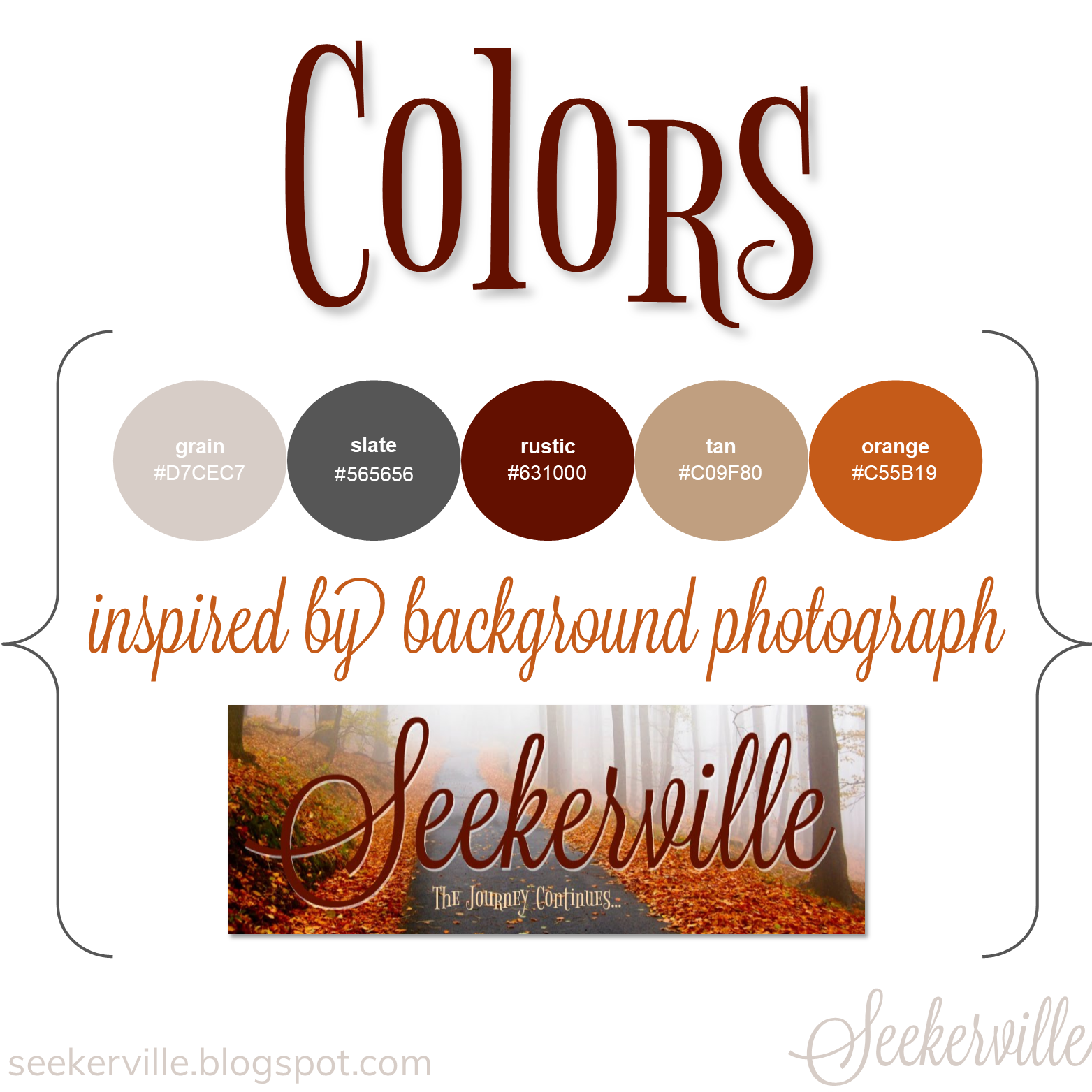
Now, incorporate them into your logo, business cards, and one-sheets. Put them in your newsletter, your social media graphics, and website. Use one, a few, or all of them, and readers will know they’re yours.
Images
Images can help enhance the tone you’re trying to convey and show off your sparkling personality. But the number one thing to remember is that they must be your own, public domain/licensed under Creative Commons Zero, or used with permission and clearly attributed to the original source.If you frequently post your own photos on social media, then using a distinct filter, lighting, or composition can also contribute to your visual branding. For example, if your content is poignant and introspective, then artsy, moody images with deeper saturation might complement it well. There are so many apps that can help make your photos unique (author Mary Weber, aka the Instagram Queen, has some wonderful tricks and techniques in her Instastories).
Typography

When making your choice, it’s important to ensure fonts are clean and legible across multiple browsers (and small phone screens, too), particularly if they’re for a blog post or another large body of text. While I’m a huge fan of a strategically placed accent fonts, too many fancy scripts or ornate flourishes can be distracting and unpleasing to the eye. So keep it simple, friends!
Templates
There are loads of programs that can help even the novice graphic designer create a cohesive visual footprint on the web. Whatever program works best, you can make templates for blog and social media content and simply interchange text, images, and colors for new posts. Also keep in mind that different social media platforms have different optimal sizes. Minding these dimensions will ensure that all of a graphic is visible and that it doesn’t get resized or warped.Say you want to do a Question of the Week post on your business Facebook page. You would find the correct size for Facebook (1200 x 630 pixels, according to SproutSocial.com), crop an on-brand, eye-catching image or solid-color background to that size, and overlay text and colors on it. Then the next time, all you’d have to do is open that saved template and change the question, adjusting the background and colors if you want to.
 Deep breaths…
Does this sound like a foreign language to you? That’s okay. While I worked in PR for many years, I’m much more of a word-nerd copywriter whose hot mess graphic design offerings leave the real pros shaking their heads. So I encourage you to feel around in the dark until you get it, even if it means bumping your shins a couple of times.
Don’t be afraid to let that brilliant personality shine in your visual branding. And when in doubt, keep it clear, keep it simple, and keep it consistent. I have full faith in you!
What do you want your visual branding to say about you?
What authors are doing this well?
What authors are doing this well?
 Laurie Tomlinson is the award-winning author of That’s When I Knew, With No Reservations, and The Long Game, currently featured in the Once Upon a Laugh collection. Her stories are fueled by faith, steaming mugs of tea, and her belief that life should be celebrated with cupcakes and extra sprinkles.
Find her on Facebook @AuthorLaurieTomlinson or her website, www.laurietomlinson.com.
More Visual Branding Resources:
● Gorgeous color palettes to inspire you
● Lots of colors (and their HEX codes) here
● Adobe’s fun tool to help you experiment with color palettes
● A list of resources for free stock photos + licensing guidelines
● Some helpful font combinations for inspiration
● A comprehensive list of optimal social media image sizes
● Simple photo and graphic editing programs to experiment with
● The best phone apps for photo editing and filters


 , my heroine Sloane is a popular food blogger who knows a lot about branding and reaching her ideal audience. Her website is called Mise en Place, a French culinary term for assembling ingredients prior to cooking. The photos she uses have distinctive color contrast and always feature shots of the recipe ingredients neatly (and appetizingly!) arranged.


