
TEXTURE can be defined as a “visual or tactical surface characteristic and appearance of something. To give a particular texture to impart desirable characteristics.”
Today I’d like to touch on three simple tips to lend visual “texture” to your story—creating an inviting appearance on the page that better enables the painting of word pictures in your reader’s mind.

1 - Build in white space for visual “texture” – Have you ever flipped through the pages of a work of fiction and been dismayed with page after page of unbroken blocks of text? You’re certainly no reading wimp, but it looks kinda intimidating, doesn’t it? Unfriendly. Boring even. Very likely you returned that book to the shelf or made the switch on your Kindle.
As authors we need to be aware of the visual impact of the story we’re writing, noting that a reasonable amount of visual white space on a page is more engaging than wall-to-wall words.

A year or so ago I decided to try a different format when drafting my books. It’s something I did as an unpublished writer (saved paper when printing to revise), but I’d gotten away from it the past nine years when required to submit in a publisher-preferred configuration. In MS Word, I formatted the manuscript as landscape rather than portrait and as two columns, setting the margins and font size to mimic two side-by-side pages of an open printed book
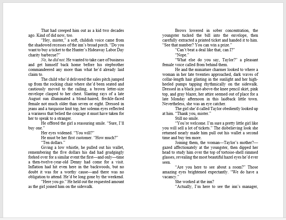
Below is an example of my first stab at it.
While readers of ebooks can change font size and thus how paragraphs appear on the screen, you could still do something similar in a standard ebook format to see what the impact might be, particularly if you’re publishing as ebook only. Give it a try and see what you think!
Amazingly, the format not only permitted me to remain aware of needed white space on a “printed” page—where to shorten paragraphs or weave in dialogue to break up a chunk of visually unfriendly text—but it also helped keep a more accurate eye on “real” scene and chapter lengths. It also converted easily back to standard manuscript structure for publisher submission.

Jo shook her head. “No.”
Jo smiled even though she didn’t feel like it.
Jo couldn’t believe her eyes.
Jo. Jo. Jo. One paragraph right after another. UGH.
Most paragraphs are at least several sentences long, and that’s when it’s especially easy to miss this repetition. (I’ve seen books with as many as 4 paragraphs in a row starting out with the same character’s name.) So “texture” the first lines of your paragraphs by varying how they start.
“No.” Jo emphasized the word with an adamant shake of her head.
She smiled even though she didn’t feel like it.
Unable to believe her eyes, Jo gasped.

3 - Add visual “texture” with a blend of dialogue - “Texture” your narrative paragraphs by breaking them up with a mix of dialogue. A reader’s eyes are drawn to those indented paragraphs and quote marks, to what the characters are saying. You don’t want a string of unattributed dialogue peppered all the way down a page, forcing a reader to “count back” to figure out who is speaking. But dialogue and its accompanying white space visually invite a reader to keep reading.
Can you think of a time when you put a fiction book down because it was visually uninviting? Are you aware of the importance of “white space” or is that something you as a reader and / or writer haven’t given much thought to? What tips can YOU share in our comment section today about adding visual “texture” to the paragraphs of your tale?
If you’d like to be entered in a drawing for a copy of my April Love Inspired release, Mountain Country Courtship (the final story in the 6-book Hearts of Hunter Ridge series) please mention it in the comments section, then check the Weekend Edition for winners!
Glynna

GLYNNA KAYE treasures memories of growing up in small Midwestern towns--and vacations spent with the Texan side of the family. She traces her love of storytelling to the times a houseful of great-aunts and great-uncles gathered with her grandma to share candid, heartwarming, poignant and often humorous tales of their youth and young adulthood.

Hi Glynna:
ReplyDeleteAre you sad to see "Hunter Ridge" come to an end or are you excited about a new adventure with unlimited possibilities?
If you had a great idea for book 7, would you consider an Indy version like Tina has with her 6th "Paradise" book, "Back in the Cowboy's Arms"?
As a copywriter I have a healthy respect for white space. I also like to vary paragraph length and also sentence length. Short sentences can be as important as short paragraphs. In a black and white newspaper advertisement 'color' also comes into play. That's when blacks, grays, bold and italic, along with a variation of type size can seem to give the page color.
Sometimes reading the copy takes away from seeing it. Artists will squint when looking at an ad and in that way the 'color' will be seen better because the mind is not trying to read it.
BTW: you can actually see what your copy would look like on a Kindle by using a program like Scrivener to convert the text to Kindle format. I do this but be careful. When your first draft looks just as good as Nora Roberts new book you just downloaded, you might more readily overvalue your work.
Also, MS Word has an option at the bottom of the screen called "Reading Layout" which can turn your copy into book page format. You don't have to mess with columns.
Can you tell us what you are now working on? Well, actually, where your next book is set. You have my favorite locations.
Vince
Good morning, Vince!
DeleteYeah, it's a bit sad to see Hunter Ridge behind me...and Canyon Springs, too, because the two were still linked with occasional visits of HR characters to CS and vice versa. I can still vividly "see" the two little towns and their characters, but have no plans to carry any of them over to the next series.
The upside to moving on is I no longer have to keep track of who is who (and how old their kids are) from the past 13 books that made up the last two series!
Yeah, if I had a great idea that wouldn't leave me alone I might consider another HR book for an Indie like Tina did if I wasn't working full-time and had more time to delve into the intricacies of that new publishing world. But time for that is still quite a ways off.
Thanks for the tip on "reading layout"! I'll have to check that out! I don't think you can type in that view, though, and I oddly discovered that the words in my head just flew onto the page when I was typing in the format that's set up like a book. Great idea, though, and less complicated if someone doesn't want to reformat their manuscript to see it in a different view!
For the next series, my editor is wanting to see a northern Arizona-set ranching/cowboy trilogy. I guess cowboys and Amish are the "biggies" for Love Inspired right now. So I'm (figuratively) dusting off my Texan great-granddad's Stetson and my copies of Western Horseman, and am preparing to (hopefully) "live" in Arizona cattle country for a few years!
Vince -- do you think "reader friendly pages" could be considered a "rewards per page"???
DeleteHi Glynna:
DeleteIf you are going to set a series in Arizona, then why not stack the marketing deck in your favor from the start?.
In a list of the "17 Top-Rated Attractions & Places to Visit in Arizona" Sedona is number 2!
http://www.planetware.com/tourist-attractions/arizona-usaz.htm
To see why check this list of the 12 Top-Rated Tourist Attractions in Sedona.
http://www.planetware.com/tourist-attractions-/sedona-us-az-se.htm
I suggest checking the cattle ranches for sale in and around Yavapai County for your setting. This location will give you many interesting places to send your characters plus provide many highly desirable backdrops for your book covers.
Millions of people would love to visit Sedona. Offer these prospects a vicarious way to do that while they are enjoying their time spent reading romances. In computer parlance that would be referred to your already install base of probable buyers for your book.
You get these people 'free' because of the power of your location and the attention getting draw of your cover art. This is what I call 'putting the marketing into your book before you write the first word'.
It's interesting that you asked if 'white space' could count as a reward for reading. I'm dealing with that question now and have for years.
In advertising direct marketing, we list things that can help improve an ads sales. That list is now over 500 items long at this point.
This tested approach to improving sales lead to my view that we can do the same for fiction. Write in a way that rewards readers for reading. We know this works from over 100 years of tested advertising methods. It should work in fiction…with the right modifications.
However, while there are things that improve an advertisement, which we might call rewards, there are also things which reduce the power of an ad and thus lose sales.
These include very small type, reverse type (white type on a black page which can reduce readership for that ad by 80%), misleading artwork which attracts the wrong customers and steals thousands of words of good copy (because the right customers for the product didn't know the ad was for them.)
This has been a dilemma for me: do I try to give reward points for things like larger type and pleasing white space or do I instead list things which reduce the rewards given. If you had 10 rewards for a page and 3 negative gigs, then your score would be 7.
On the other hand, this makes the RPP harder to figure out (you have two lists to compile not one). But what if I gave only rewards? Then the 10 would still be a 10 but it could well have 3 negatives which would not be figured in the total. So one 10 score might not be nearly as good as a 8 score which had no negative gigs.
Choices like this, plus trying to delineate rewards so that different people will come up with the same totals, has been keeping my tied up for years. It is all so subjective in fiction because I can't run the ad to get real world results.
I'll just have to keep working on it until I can finish the book as well as I can. Even Einstein couldn't come up with a unified theory given the rest of his life time. Some problems are hard to solve. :)
Tip: Channel Sedona and buy a crystal! The vortex is the limit!!!
Hi again, Vince! I love Sedona and Oak Creek Canyon--but sure wish some wise person would have designated the entire area as a State or National Park a LONG time ago.
DeleteYou look at the old western movies set down there and it's just so open and gorgeous. All breathtaking vistas. Now it's super expensive homes everywhere you turn and bumper-to-bumper traffic much of the year.
Thanks for your marketing angle input! I agree, those red rocks would make super impressive cover! And Sedona has such a unique ambiance. A western flavor. Diverse artists and craftspeople. Tourist energy and funky shops. Creekside dining. International visitors.
I used to love fishing in--and hiking around--Oak Creek back in the days when it wasn't so overcrowded. The drive down Schnebly Hill Road (if you had a 4-wheel drive) was always an adventure, too.
I'll give the Sedona area serious consideration as my story ideas evolve! Thank you!
That's interesting that it's known that white type on a black page reduces readership by 80%--so you have to wonder then why advertisers still do that because it IS so hard to read.
I find your "rewards per page" points fascinating-- something that we as writers do need to keep in mind as we attempt to bring readers along for a satisfying "story ride."
Hi Glynna:
DeleteWhat you lament about the Sedona area is a result of it's mass market popularity and drawing power as a novel's setting…the very reason to set a story there. Sometimes one's "Paradise Lost" is another's "Paradise Regained". It's all POV.
I can remember putting aside a book a few months ago because the pages were just solid text. My eyes and brain just found this hard work.
ReplyDeleteCount me in thank you.
Good morning, Mary--or whatever time is "down under" at the moment! :)
DeleteReading solid blocks of text IS hard work. And it's so easy to lose your place on the page and have to re-read.
Your name's been thrown in the Stetson! :)
Charles Dickens would have a hard time publishing today.
DeleteSO true, Kathy! I love the "classics" but you do have to approach them differently than you do with what our reading expectations demand today.
DeleteGlynna, what a great look at such an important subject. (and it was a rule that I broke so completely as a new writer back in the Mesozoic Era!!!)
ReplyDeleteWhat an interesting vantage point for the author, oh, smart one! Well done!
Mornin' Ruthy! We did a LOT of writing rule breaking "back in the day" didn't we? :)
DeleteIn the edits phase when the publisher sends it to us for review in book-page layout, I often decided to break up some paragraphs here and there for a better "visual." So I decided to try writing in that layout and it worked well for me. May not do it that way all the time, but I was in need of a visual change--courier new double space had lost its luster. :)
And yes, I remember chucking a series aside from a very well known author who must have gotten to that point of not listening to editors... and she had page after page after page of engineering information that probably seemed brilliant to her... but was a huge turn off to me.
ReplyDeleteI love the brilliance slipped in bit by bit or through clever (and often amusing!) dialogue... but to get plateful after plateful of it to show the author did his/her research....
Bah. Humbug.
I think it matters to most of us, but I'll be interested to see what folks say, Glynna!
I guess when we get to be well-known authors we an do whatever we want to and still get a paycheck. LOL
DeleteYeah, too much research in big blocks doesn't exactly deliver what our Vince calls "rewards per page" by a means that seems like a "reward." So much more effective and appreciated (readers love to learn new things) if woven in among dialogue and inner thoughts. The "brilliance," as you called it, shines brighter in a more reader-friendly setting.
It will be interesting to see if today anyone says they LIKE reading dense text page after page and why. We all have different preferences.
Ruthy, I just put back a book by a well-known author because of all the exposition at the beginning. (NO, it wasn't a Seeker, Seeker Emerita or Villager.) Page upon page upon page, Lady, where you goin' with this? I hope she knew because I sure didn't.
DeleteI've done the same thing, Ruthy. There's a well-known Christian fiction writer whose early books I devoured. The last couple of her books that I've read were so bogged down with technical, detailed excess, that my brain just turned off. The story was lost in the midst of it.
DeleteCOFFEE IS HERE!
ReplyDeleteThanks, Ruthy! Not a coffee drinker, but everyone else help themselves! :)
DeleteThank you, Ruthy! I need a pick me up right now. Wait. I just looked at the clock. I see it's lunchtime! LOL Man, I guess I need to eat rather than drink coffee. haha
DeleteHi Glynna, what a beautiful cover for your book. It sounds like a great story!
ReplyDeleteI've heard of creating white space, but I hadn't thought about the other tips as texture. If a book's font is too small, I'll put it down and some fonts are just harder to focus on. Although, if the book was by one of my favorite authors I'd try to find large print or buy the Kindle version. You've made me wonder if publishers have trained us to read Times New Roman. Ha! That'd be an interesting psych experiment.
Thanks for sharing!
(Ruthy, thanks for the coffee!)
Hello, Jackie! So glad you like the cover! My very first "bride" cover. :)
DeleteMore and more publishers are making font smaller to save paper/ink costs when printing. Reading that can sometimes be as tiring and off-putting as a page packed with unbroken text.
Thanks for stopping by!
I actually write in Bookman Old Style. Robin Hatcher recommended that to me years ago, and I still use it.
DeleteI'll have to give Bookman Old Style a try, Missy.
DeleteBookman Old Style? I'll look it up. Thanks for sharing!
DeleteGlynna, I love that cover. And I love how you described having texture in your writing. I've never thought of it that way, but you are spot on. Thanks for the tips.
ReplyDeleteHi, Mindy! Glad you like the cover and found the few "texture" tips useful!
DeleteGlynna, good post. Nothing annoys me more than having to "count back" to see who said what. Necessary to have short punchy sentences in certain situations, but also need to know who's talking.
ReplyDeleteWe have to make the reading experience as pleasant as possible, especially in these tumultuous times.
Kathy Bailey
Hi Kathy I missed your first comment, so said good morning in the second! :)
DeleteI hate "counting back," too. Bleah
No matter how well we write or how engaging the story and characters are, if it APPEARS unfriendly on the page we could lose readers who won't even start reading to begin with.
There are so many demands on people's time and attention these days and they want to be immediately pulled into a story. So anything we can do to ease them into our imaginary world and not put them off visually is a biggie.
Please enter me in the drawing. I like Hunter Ridge and in point of fact used the Jodie-and-Garrett story as one of the templates for MY new Christmas romance. Enjoy the adventure of heading off to a brand-new series!
ReplyDeleteGood morning, Kathy! So neat that The Pastor's Christmas Courtship played a small part in YOUR Christmas romance!
DeleteI know when I was first preparing to write for Love Inspired, I "dissected" books of favorite LI authors--how many pages per scene and chapter, how did they begin/end scenes/chapters, where the "first kiss" and black moment appeared, etc. Wrote down what I liked most about the stories of my favorite authors.
That paid off because the first book I wrote targeting LI garnered being chosen by an LI Senior editor as a first place contest winner AND a contract offer!
I'm SO looking forward to reading YOUR book when it comes out!
Your name's in the Stetson!
Glynna, I did the same thing with my first few books! Studying books from your target publisher this way is invaluable experience - and a compliment to the author, too!
DeleteI love how that helped you ladies sell your first books!
DeleteI also analyzed the stories I cared less for...figuring out what it was about them that didn't work for me. We all enjoy different styles and plots and characters and readers need variety, but it helped to learn what appealed to me most and what I was most comfortable writing.
DeleteGreat post, Glynna! Thank you for sharing.
ReplyDeleteGood morning, Caryl! Glad you found the post helpful! :)
DeleteI love the idea of re-formatting the manuscript to see what it looks like in "book form." Thanks for the tip, and put my name in the Stetson!
ReplyDeleteHi, Linda! I knows it seems a little 'crazy' to reformat, but I actually found the words flowed better when I was seeing it in "book look"!
ReplyDeleteYour name's in the Stetson!
I KNOW it seems, not I KNOWS it seems! LOL
DeleteI need to be out-of-pocket for a bit, but I shall return! :)
ReplyDeleteHi Glynna!
ReplyDeleteWonderful post. I look for things like paragraph starters, word repetition, etc. when I do my morning read-through before I begin writing each day. It's easier to catch them a few pages at a time rather than waiting until I'm polishing the manuscript before turning it in. :-)
And I had never thought of doing a reading layout as part of the revision process. I'll try that with my current WIP!
Great idea, Jan, to make it more manageable in bite-size pieces. I know "they" advise to save revisions until after the manuscript is completed. But I'm like you, I like to revise as I go so that when I hit THE END I'm pretty close to sending it out the door.
DeleteOooohhh this is interesting! When you said texture I immediately thought the way an author adds layers to a story -- kinda digging deeper to deliver a more fulfilling story. But it actually has to do with white space? who knew? Visual texture. Hmmmm.
ReplyDeleteNow that you mention it, there is this one author I've tried to read a few times and just got bogged down. Very wordy and long, long paragraphs that didn't go anywhere. You could pretty much skip three pages and stay on top of the story. So is that what you mean -- the white space is a kind of guide to help you with your pacing?
Hi, Kav! Great point -- the "white space" breaks up the page visually, making it easier to read, which in turn CAN help with perceived pacing. Readers have to slow down to digest larger chunks of text (which is one reason we don't want it TOO dense even when we want to slow things down a bit--we don't want it slowing down the pace too much OR make readers skim or skip over because it's just "too much.")
DeleteGlynna, this is so interesting! Something I haven't thought a lot about. HOWEVER, now that you mention it, I really don't like seeing huge blocks of text. It makes me feel tired just to see it! LOL I also notice when several sentences start with the same word. I often catch that in my own writing and have to fix it.
ReplyDeleteI love your idea of laying out the document like a book. I'll definitely try that! I usually print my manuscripts that way but have never worked with it that way. I love that idea and love that you said it actually helps the writing flow.
Hi, Missy! I enjoyed writing in that format. I told Tina about it and I think she was going to give it a try, too. It's probably not for everyone, but I needed a "boost" at the time--something different--and the nice thing was is it converted so easily to the standard manuscript format when I was done.
DeleteThanks for the post! So much goes into creating a story! Would love to be entered into the drawing!
ReplyDeleteHi, MJSH! Thanks for stopping by! You're in the Stetson! :)
DeleteGlynna, I definitely notice white space as a reader (or lack thereof), probably because as a teacher I try to be aware of how text looks to students. My seniors just finished a novel, and I have two different versions of the book. The paperback is text heavy, but the hardback version is larger and has more white space--and as a result--more pages. It's funny when I hand out the books and a student complains because s/he wants the book with fewer pages. I remind them the story is still the same length. :) As a writer, though, I think I need to be more aware of white space. Thanks for the tips!
ReplyDeleteHello, Karen! That's interesting about student complaints regarding the "larger" book even though the word count is the same as the paperback! So much is about perceptions, isn't it?
DeleteGlad you found the post helpful! :)
It never occurred to me to write with the screen pages formatted to look like a book. That's a great idea. I'm going to try it :-) Thank you!
ReplyDeleteHi, Jenna! Hope the alternative formatting works for you! I used to do that years ago pre-pub, but had gotten totally away from it through the years. I like it, too, because when I print out to redline it takes WAY fewer pages!
DeleteGlynna, I so appreciate your suggestions to be aware of the textures of our pages. I love the idea of putting our pages in a landscape format to mimic the look of a book when we edit. I've never thought to do that.
ReplyDeleteI am the one who sometimes has a number of paragraphs in a row beginning with a character's name. Thanks for the reminder to look for that and for thoughts on how to change them up!
Have a wonderful Easter!
Hello, Jeanne! I'm happy you found the post helpful. Hope the change in formatting helps. Crazy me, I just REALLY enjoyed writing in that format for a change after years of 12 point Courier New double-spaced.
DeleteSO easy to start sentences a character's name over and over, especially when writing in standard double-spaced manuscript format.
I hope you have an extra special Easter, too!
I think the weather in Arizona mountain country may actually be decent for it this year--sunny and in the low 60s rather than chilly and snow! I even have hyacinths blooming!
Great blog post, Glynna. I never thought of it as texture, but that's a perfect way to describe what I consider the "visual" aspect of writing. Usually my eye tells me when there's a problem. I like white space and varying sentence structure and paragraphs that don't start in the same way. Also the use of ellipses, dashes and em dashes can help to make the manuscript more visually appealing.
ReplyDeleteI have used the two-column format for a final read, although more often I change the "print view" to "web view." Reading the story in the web format allows me to pick out problems more easily.
Hey, Debby!! I agree--variety keeps a reader on his/her toes with visual cues, not lulled into samey-samey repletion that's too easy to skim over.
DeleteI've never read in web format before. Will have to give that a try!
These are great tips, Glynna! I agree, there are many advantages to reformatting in two-column landscape and changing the font to something more "bookish."
ReplyDeleteI have begun doing this for every book once I'm down to the final stage of revisions. It's a great way to visualize what the printed page will look like, plus it gives your eyes and brain a fresh view and not the same old manuscript format, which I think makes it easier to catch problems.
Hello, Myra!! You're so right--after staring at the same-old-same-old formatting, switching over to read your "final" version wakes up the brain and alerts your eyes to catch things you probably wouldn't have otherwise caught. I can't believe I used to switch like that all the time pre-pub, but totally got away from it. DUH! :)
DeleteI have to dash off again, but will be back later. Some of you are 3 hours ahead of me with daylight saving time now, so will probably have picked up all your toys and gone home for the day by the time I return. :( But I WILL be back!
ReplyDeleteGood post, Glynna. I may have to try the two-column landscape with my book.
ReplyDeleteHi, Sandy! I thought it was really fun to do it that way for a change. Hope it works for you, too! :)
DeleteThanks for sharing these great tips. Even those of us who prepare papers or presentations can benefit from the landscape option.
ReplyDeleteHi, Connie! Good idea! It's a fresh way to look at things!
DeleteGreat post, Glynna! I just bought your book a couple days ago and can't wait to read it! You know how much I have loved this series! I'm sorry it has to end! It will feel like I have moved away from a familiar place!!! What's next for you???
ReplyDeleteHi, Valri!!! Hope you enjoy Denny & Lillian's love story!
DeleteLooks like I get to tap into my inner cowboy for the next series. :)
Ohhhhh, I can hardly wait! Look forward to learning more about that inner cowboy!
DeletePlease drop my name in the Stetson for your final book in the HR series. I have loved the series. Looking forward to your next series! THANKS.
ReplyDeleteHi, Jackie! So happy you've enjoyed the Hunter Ridge stories! I've tossed your name in the Stetson! :)
DeleteI've not put a book down it was visually uninviting, but some school books I have had to read have been... shudders. Sometimes too small format all in one paragraph so I'm constantly losing my place. It's torture. I just finished Emma and however interesting it was, some of those paragraphs (especially the ones with Miss Bates talking) would get awful long.
ReplyDeleteI don't generally put too much thought to the visual texture of my stories. I write with 11 point font because 10 is too small and 12 too big, indent the paragraph .20 or.25 and just try not to let my paragraphs get to big. If they do then I break them up.
Please enter my name in the drawing :)
Nicki, I love Jane Austen but Emma was my least favorite.
DeleteHello, Nicki! Boy, do I remember some of those school books, so I know what you're talking about!
DeleteSounds as if, though, you're already instinctively taking white space and paragraph lengths into consideration as you write!
Your name is in the Stetson! :)
I love this, Glynna. All solid info. It really struck me the
ReplyDeleteJo
Jo
Jo
Because the heroine in my wip is named JO, yes Josephine but she'd Jo to everyone through the book.
And it's so true that it is easy to fall into a habit of starting paragraph after paragraph with the same word. Great advice.
Mary -- so I was channeling your latest heroine? WOW. :)
DeleteI'm guilty as charged, too -- so easy to do that, especially when I'm writing in Courier New and double-spaced so it's spread over several pages. You don't see the "whole" as easily.
Lots of great ideas. Thank you for sharing. We may not have illustrations but the visual effect still plays an important roll.
ReplyDeleteI would love to be entered in the drawing for your book. Have a blessed day.
Hello, Betty! Glad you found the tips helpful! Your name has been thrown into the Stetson! :)
DeleteLate, but here!! Glynna, always glad to see you here!! This is awesome insight into the draft. And so true, so we better not keep it a draft! Thanks for pointing out all the obvious "textures" we miss as we try to get a story down on paper. I'm going to keep this list beside me as I edit!!
ReplyDeleteHey, Audra! Thanks for popping in at the end of a busy work day! Glad you found the post helpful. :)
DeleteHi Glynna, What a great post. I was so guilty of starting my paragraphs with the heroine's name so many times in a row. You would think after all the times my crit partner pointed it out, that I would learn. LOL.
ReplyDeleteWhat great reminders of ways to texturize your writing. You always have such great photos to illustrate your point. Thanks for sharing.
Hi, Sandra! Thanks for stopping by even though you're "retired" from writing! :)
DeleteWhat a lovely post. I love that you've touched on both visual and auditory texture. I test the auditory texture of a piece by reading it aloud. That way I can hear that I've started four paragraphs with the same word, or I've used the same word too many times too close together.
ReplyDeleteExcellent post!
Hello, Erica! Reading aloud is such a great idea. Thanks for mentioning it. I do that, too, and it REALLY helps with rhythm of sentences, weeding out repetition, and keeping the dialogue sounding natural!
DeleteI find myself skimming when the texture is "off". Especially through those huge blocks of text! Great reminder. :)
ReplyDeleteHi, Angela! We sure don't want to encourage our readers to skim if we can help it! Glad you found the post helpful!
DeleteThis was very interesting. I’m sure it plays a part in my reading enjoyment. Thankyou, i only write reviews but it will help me!
ReplyDeleteHello, Paula! White space on the page as it lends itself to readability is something we don't always think about when writing. I'm glad you think the awareness will help with your review writing, too!
DeleteI'm not a writer, but I agree, Glynna. The text needs to look inviting, and not enough white space or too much dialogue throws the story off for me.
ReplyDeleteI'd love a chance to win your book. You're a new-to-me author. I'm glad to get to know you through Seekerville!
Hi, Winnie! Even in spite of our efforts as writers to provide that desirable white space, if we're traditionally published it's our publisher who determines how many words on the page, how wide the margins, how large the font, etc., and they're always attempting to cut printing costs in order to stay in business
Delete(I've noticed paragraph indents and margins are getting smaller, so even if there's an abundance of author-induced visual breakups on a page, it's not so apparent in final publisher format.)
Your name's been thrown in the Stetson! Thanks for stopping by!