

Also, in Part I we dipped our toes into editing your photos so that they are the perfect background for your book cover. Today, let’s take that a step further. And, one other thing I don’t think I’ve mentioned… for simplicity’s sake, we’ll be designing ebook covers only in this series of posts, not wraparound print covers. However, if you plan to publish your book as ebook and print, think about designing the cover for both from the get-go.
I’ll be using the paid version of Picmonkey Pro as my main design software in this series of how-to’s, so there will be a few filters that are only available in the pro package. Regardless of which design software you choose, many of the terms and techniques are interchangeable, and I've found that I learn from articles and workshops regardless of which software is being used.
Picmonkey Pro costs $120.00 a year. There is a free version of Picmonkey, but I discovered years ago that I use the paid program enough to get my money’s worth. As mentioned in the previous post, whichever design software you’re using is perfect for YOU. Sure, Photoshop, Canva, CorelDraw, etc. might have more/better bells-n-whistles than a competitor, but the learning curve is sometimes too steep to jump off the cliff. And finally, one last word about the multitude of different design softwares available. A quick search revealed that the yearly price range is comparable for most of what I’d call the “poor man’s design software”. If you’re new to design software, play around with a few and see what feels right for you.
Now, let’s have some fun. :)
Just like an artist decides on the background color for his painting before he starts painting, the photo(s) you chose becomes the “background” for your book cover.
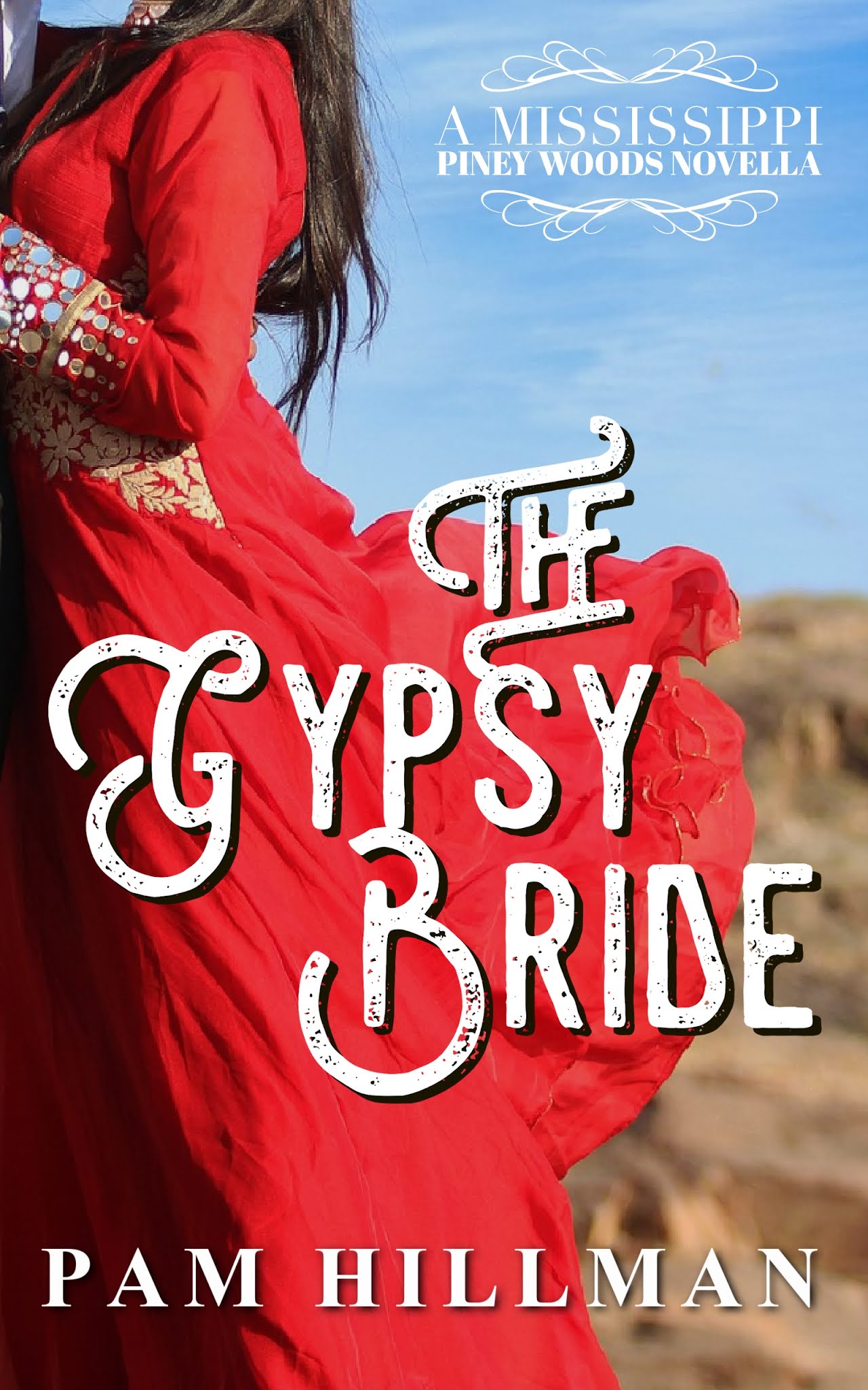
In Part I of this series, I showed a photo of a girl in a red dress that I really liked, and that I dubbed The Gypsy Bride, even though I don’t have a gypsy bride story… yet! I cropped the photo so that the style and placement would (or should) complement the cover of The Evergreen Bride, the first book in my Mississippi Piney Woods Novella collection. So, let’s see how this pans out.
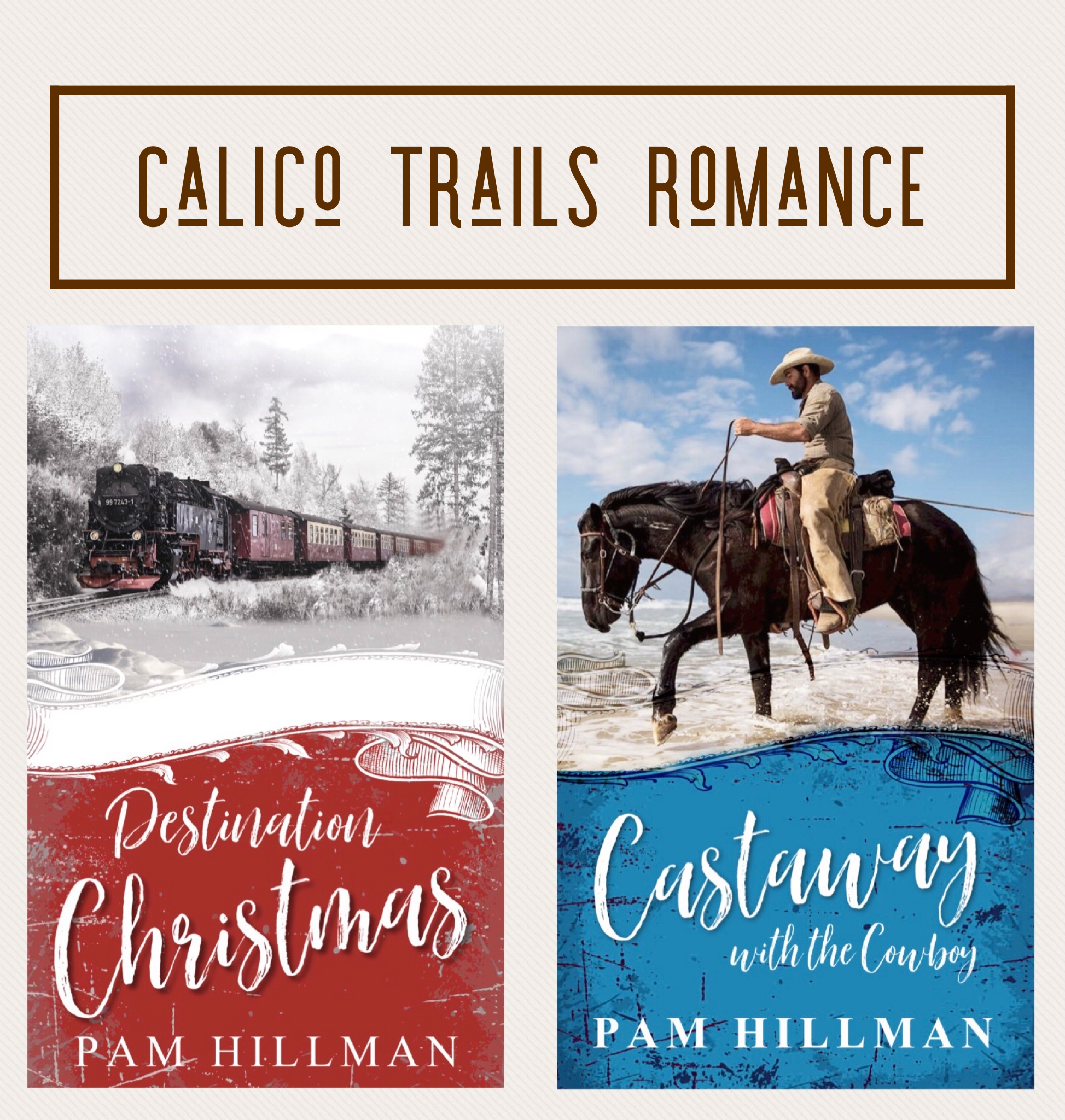
If you’re doing a series, you want to use the same basic layout from cover to cover, but use different photos and color schemes so that readers don’t skip over your cover, thinking they’ve read the book before. You want similar, but different enough to catch the eye. A good example are the covers from my Natchez Trace Novel series that the amazing team at Tyndale designed, and the first two releases in my Calico Trails Novella Series that I designed.

Back to the Mississippi Piney Woods Novella “template”. We want the cover we're about to create for The Gypsy Bride to end up complementing The Evergreen Bride in theme, layout, and style. What do you think? Can we take the photo on the right and come up with a cover that works well with the one on the left? Let's see...

Step One: Create a template in your design software for your future ebook covers. Open your software (again, I'm using Picmonkey), create NEW, then BLANK CANVAS, and enter the dimensions.Dimensions for a KDP cover should be 1600 x 2560 pixels. (1583 x 2500 works as well). You don't HAVE to use these dimensions, but they do work. The key is that your height/width ratio be correct. To read more about this topic, check out this article.

Step Two: Duplicate or Save a Copy of your new ebook cover template. You'll see at the top of the screenshot below that it says "Gypsy Bride". This step isn’t necessary, but if you do this, you’ll have a blank template every time you get ready to create a new cover. :)
 |
| Step Three Screenshot |
Step Three: With your saved and renamed template open, click “Add Image” (in the top left part of the screen) from wherever you have it stored. This might be your computer, Dropbox, the cloud, or even your Picmonkey hub if you’ve already uploaded it to the software. In the screenshot above, I added the entire photo of the couple. As you can see, it's almost perfect for the size of the cover (that's the thin blue-line box around the couple), but since I'm not going that route, that's immaterial.
 |
| Full photo before expanding/enlarging |
Step Four: If you only want to use part of the image, enlarge it, making sure to retain the aspect ratio. I want to focus on the dress and crop out the girl’s face, leaving her features to the reader’s imagination. Use the little "circles" in the corners of your photo to enlarge it up to (and even BEYOND) the size of the template you're working on. Once you get it to the size you want, you have two options: you can either crop out the excess part of the photo that you won’t be using, OR you can just use the LAYERS tool to FLATTEN the layers. Basically, that locks (or flattens) your photo image to the 1600 x 2560 size you started with.
See the Layer tool in the image below? Then below that, the "Background/Convert to layer" instructions, and then the small "stacked layers" icon with the arrow pointing down. That's the "Flatten Layers" icon. Once I got the RED DRESS just like I wanted it, I clicked that little "stacked layers" icon, locking in my background. I can un-flatten and resize it if I change my mind, but it's locked in for now.
 |
| Photo expanded to fit the 1600x2560, leaving the part I wanted on the cover. |
Step Five: At this point, you might be ready to play with shades, textures, and shadows on the background if you have a particular filter that you just know will make your image perfect. But maybe the background in the photo above is just right as it is. Who knows until you try, right? I do know that I want that red dress to pop. It's a stretch to use a red dress on a bride book, but for a gypsy bride, I think it works. Since I wasn't sure if any distressing, antiquing, or textured layers will fade the dress out too much, I went ahead and added the title, series tagline, and my name to get a starting point for the cover. (We’re starting to move into fonts, so I’ll talk briefly about those at the end of today’s post, but reserve the tutorial on creating each of those layers for another day.) With no filters or edits (other than cropping), we’ve ended up with Version 1. I like it. Seriously, I could go with this cover just as it is. But, what if we play around a bit...
 |
| The Gypsy Bride, v1 No filters on the background |
Step Five: Play with shades, textures, and shadows. With all the other layers added, you need to click on the background layer (the red dress), and edit it. I ended up with several versions. Will one of these end up being THE one? Maybe. Maybe not.
 |
| The Gypsy Bride, v2 |
 |
| The Gypsy Bride, v3 |
 |
| The Gypsy Bride, v4 |
Okay, I'll be honest. I'm having a hard time picking one of these over the other. And they are TRULY close in style. The filter on V3 is the only one that really "dulled" the red dress much. But since I knew I needed that dress to stay a nice bright red, I couldn't use too many filters. But I do like the extra texture that the filter gave to the dress in V3.
Questions? More on background aspects of covers, like split covers that I'm using for the Calico Trails Novellas? Or move on to the fonts and title treatment?
 |
| The Gypsy Bride, v3. Maybe??? |
At the last minute, I created VERSION 5. I duplicated the RED DRESS background, and added Picmonkey's red smudge filter, made the title just a tad smaller, more in keeping with The Evergreen Bride title. I like the way this doesn't change the dress too much, but darkens the sky and also gives it the look of a painting like brush strokes. This might be the one I choose. :)
 |
| v5... I am SO conflicted!!! lol |
Okay, that's the end of today's lesson. Let's chat. Are y'all interested in seeing more about the background photos, like how to do SPLIT covers like I did for below for my Calico Trails Romance novels, Destination Christmas and Castaway with the Cowboy? If we go this route, you'll see that you will probably use filters on the abstract parts of a cover more than you can (or probably should) on a photo. But, again, that's according to taste and genre and the photo, I suppose.
Or would you prefer that we move on to fonts with the next installment in this DIY blog series? I use fonts from Picmonkey and Wordswag, and I found a new cool website for fonts that I want to play with to create unique titles. Then there's deciding when to use color in your titles, and when and if they need drop shadows, etc.
So, should we discuss split covers next or fonts?
Click here for Part III
DIY Graphics Design Tutorial: Fonts, Titles, Series Logos (Part Three)
And last, don't forget my Kindle Countdown deal for Destination Christmas ends in THREE days!! Buy, share a meme, read the excerpt. Toss a penny in my tin cup. Ha! :)
 |
| DESTINATION CHRISTMAS sale ends Dec. 12th. |
Oh, Pam! I'm so glad you split up this subject into different posts!
ReplyDeleteI've been using Picmonkey for several years, so I think this learning curve will be easier to manage. The free version works well for most things if you're a beginner with it. I upgraded to "basic," which is less than $50 per year. If I start designing covers, the pro version will be worth upgrading!
I hope you're planning to do both split covers and fonts in your next two posts - it doesn't matter too much which comes first as long as you do both!
Thanks so much for sharing this information!
Jan, I think I spend TOO much time playing with picmonkey, WordSwag, WordSwag, and now the Reels on Instagram. Someone should delete all these programs and apps off my laptop and phone so that I'd get something else done ... like writing! :)
DeleteWell, I commented in the wrong place! Meant to comment on part 2. I really appreciate these posts and plan to bookmark them for later when I get brave enough to attempt this! :)
ReplyDeleteAnd I commented on your comment. :)
DeleteYes, I think I like v5 too!
ReplyDeleteWith your artistic bent, I could have guessed that. Reminds me a bit of brushstrokes. :)
DeleteYes, Pam! I love the brushstrokes of oil painting. Whenever I paint with watercolors (usually because I don't have time for oils), I miss that texture. :)
DeleteYour cover design series fascinates me, Pam. Thank you! I want to do this. I’d like to learn about split covers next. I’m always drawn to that type of cover, but wonder if the style is right for the tiny thumbnail book displays. Whichever topic you do next, I’ll be here and learning!
ReplyDeleteSherida, we'll definitely cover split covers then. I love those as well and was a bit surprised at myself for planning a simpler cover for The Evergreen Bride.
DeleteBut I'd just designed Destination Christmas, which was my first cover, and it had take longer to do than I wanted. I had to do some editing on the train photo, plus I'd did several layers and filters on the distressed bottom half of that design.
Then, all of a sudden I had the rights back for The Evergreen Bride, and didn't want to spend days and days on the cover with Christmas looming. Anyway, when I settled on the billowing dress for all the covers for this series, the simpler "one photo" felt right.
But... I still secretly love the split covers. :) And since I had a template for what I wanted, Castaway with the Cowboy didn't take very long at all to make. Finding an appropriate photo was the biggest challenge.
Hi Pam:
ReplyDeleteQuestion: Does that woman in the red dress have a bustle? Given the man's clothes, it might be the right time period for a bustle. The problem is the woman's hair. If the wind is blowing the dress outward, then her hair should be blown in the same direction. I always check for total picture problems like wind, shadows, and sunlight coming from several different directions.
BTW: red is the color of wedding dresses in India. Perhaps the Gypsy is from India. In fact, I'd like to read that story.
Also, please do the fonts next. It's not a book cover without type. Getting the type right can be very tricky. Art people tend to consider type as getting in the way of the beauty (and award winning/career advancing possibilities) of their efforts. Copywriters want to have what the type expresses rendered readable. (Can you read the copy or is it in narrow italic hidden in out of the way light colored reverse type).
Of course, if you are designing your own art, you can please yourself. Both elements are important: the picture acts to capture the attention of the prospects mostly likely to read the book and the copy acts to sell the viewer on reading more about the book…that is, to delve inside for more persuasion. Art and copy have to work together for maximum selling results.
Great series. Keep the ball rolling! :)
Hello Vince! So good to "see" you here today.
DeleteAbout the original photo of the couple. There is no bustle on the dress, it's just blowing "in the wind". It could be argued that since his arm is around her waist (you can barely see his hand at the small of her back) and has captured the bulk of her hair, then that is why her hair isn't blowing as much as her gauzy dress. In addition, his upper body could be blocking part of the wind. OR the fan the photographer used for this shot is only blowing on the lower part of the the couple. Shrug. lol
I'll have to keep in mind my gypsy girl's country of origin. I do know that the story will be set here in the MS Piney Woods since Kelly Mitchell, the Queen of the Gypsies, was buried in Meridian, MS in 1915. My story will take place several years prior to that, but the gypsies had been traveling through this area for years prior to and after that time period.
I'm itching to get to the fonts for all the reasons you mentioned, but I'm taking a logical approach to this blog series and thinking of each section in layers. The background photos and textured layers come first. Yes, technically, you work on it all at the same time, but since I want to take this one step at a time so not to overwhelm those just getting started, well ... uh .... we're doing it one step at a time. lol
I'll be back with at least two more posts on this topic, possibly more. :)
Hi Pam:
DeleteI had the same idea you did. I thought the wind was coming from a fan on the floor in the photographer's studio. Also, the photo I was concerned with was the full couple at the top. The cropped versions presented no problem as the other parts of the body were not in the picture. In any event, in the large photo of the couple, if there were that much wind, there would be a lot of dust in the air. (They look like models posing for a book cover which is what the reader expects.)
I used to love those photos, I think they were in the Saturday Evening Post, which were titled: "What's wrong with this Picture". They were so much fun that ever since then I've looked at photos with errors in mind. I also like catching mistakes in famous movies. Like one where the heroine is wearing a different skirt in the same scene before it is over.
I have to agree to teach the skills in layers. It is a logical way to go.
This is going to be a real keeper of a series. Keep up the great work.
Vince, I could play with this stuff all day. I'm amateur graphics designer, but I have been doing this for over 30 years. My first foray into "graphics" design was using the themed napkins and paper plates that my co-workers bought for their kids birthday parties, printing or hand-lettering the invitations, and making copies on a black and white copy machine! lol
DeleteWe thought it was grand! I had a scrapbook somewhere. I'm pretty certain I didn't throw it away!
And, the series is shaping up to last at least through May or June. I've got a long list of stuff to cover. :)
PicMonkey is my go-to as well. I use a few other programs for specific things, but I don't know enough about the more advanced programs to make the cost worthwhile. This is a great tutorial, Pam!
ReplyDeleteThe one thing I want to learn how to do (and I don't think PicMonkey is the best program for it) is to fade pictures together from top to bottom. It's very popular on many covers, but I'm not sure how to get that effect. I know how to do split covers (like yours above). It's the ones that have an image (usually a person or couple) at the top of the page, a different image at the bottom (castle, house, boat, train, landscape, etc.) and they are just faded together with a cloudiness between them (I'm not sure of the term for this effect). Is this something you've ever tried to do with your covers?
The covers of these books gives you an idea of what I'm talking about.
Deletehttps://greatbattlesforboys.com/
Beth, I too like the fade that merges two images to create a blended cover from top to bottom... if it's done right. The example you sent is beautiful and the perfect illustration of this technique.
DeleteI'm definitely an amateur designer, but I'll give your question a shot. :) I haven't designed a book cover using this technique, but I've done memes and banners so I think I could manage it.
First, I think the images chosen for such a project are the first line of defense (oh, good pun for the cover you chose! lol) in creating a successful cover like this. The two images in Great Battles for Boys are very similar in color and tone. The designer might have had the skills to edit both to achieve the end result, but since I might not have the skills OR the time, I'd do my best to find images that complement each other from the get-go. I'm not saying you HAVE to start with images that complement each other, but I think you'd be ahead of the game if you did. :)
Second, I'd take a page from the designer's technique of using a big, bold title between the two images. That sets the images apart, but also pulls them together nicely, I think.
Third, the bottom photo either has plenty of room at the top to use for the blended area (ie. the smoke from the battleground), but if it doesn't you can use the CLONE tool or even a BASIC SHAPE to fill in this area. Also, use the edit/erase tool to blend your two images.
I've used the oval shape of the BASIC SHAPES tool so many times it isn't even funny. Add the oval to your project, then use the edit tool to fade out the hard edges, use the eye dropper to get the color you want, and keep playing with it.
For fun, I just created a very rough cover and did a screen recording while I did it. I'll try to share it somewhere so you can see what I did. Again, it's rough, and not one I'd call done right at all, but it might give you some ideas on how to get started.
Thanks for the link, Beth! The covers are great!
DeleteBut the subject matter of the books was what really caught my attention. I ordered one for my husband - he loves military history. :-)
Jan, isn't it great to find an unexpected gem when you least expect it? :)
DeleteAnd... I'll follow up with my idea to do a mock up of a split/fade cover and the Screen Recording I did. Since my time is almost up today/this week, I'll address this in the next blog post. I can't wait to show y'all what I came up with, and maybe by then I'll have figured out how to add sound to my Screen Recordings. :)
Love these posts, Pam. I'm a sucker for great fonts and typography, so I can't wait to see what you do with those. I love the font you used for the title, btw. Thanks so much for all the info.
ReplyDeleteI love working with the fonts and typography as well. I probably need to spend more time writing than creating cute covers & memes. lol
DeletePam, these posts are amazing. So much detail and helpful steps outlined. It makes me want to start designing book covers! :)
ReplyDeleteI know. It's quite fun! I only do it for myself. I'm afraid I'm a little too OCD to design for others. lol
DeleteThis is so interesting, Pam! I'm not an author or a cover designer, but I find this fascinating. Thanks for showing your process!
ReplyDeleteGlad you're enjoying it, Winnie. It's my pleasure to show the method to my madness. :)
DeleteThis comment has been removed by a blog administrator.
ReplyDeleteThis comment has been removed by a blog administrator.
ReplyDelete