
Well, I'm back with Part IV of my DIY graphics design series. If you missed the previous posts, here are the links: DIY Graphics Design Tutorial: STOCK IMAGES (Part One), DIY Graphics Design Tutorial: PHOTO EDITING USING PICMONKEY (Part Two), DIY Graphics Design Tutorial: Fonts, Titles, Series Logos (Part Three).
By request, today's post focuses on how to use the programs and resources covered in Parts I, II, and III to create DIY book covers by merging two or more photos to create attractive covers.
First, it takes a professional graphics artist with high grade software to mash, smash, mix, and combine multiple photos of landscapes and people and make it all look as if it was all taken together. I'm not a professional. I'm a rank amateur and a DIY guru. The covers I've created aren't meant to look as if they were photos taken that way. But there are techniques to get around that obstacle.
So, let's get started...
The untouched photos of the woman and the landscape below were chosen to compliment each other. Ideally the photo of the woman would have had a bluer sky to make it easier to "merge" the two photos, but I decided to work with this one as is. I actually made this "mockup" cover a couple of months ago in preparation for this blog post, but realized I didn't have enough screenshots of the process to show you much of what I'd done. So I created another one yesterday, and decided to show both as they each employ some different techniques.
And, as I was going to "press", a friend shared a great FREE resource that you're going to love! I'll share it at the end.
 |
| horsewoman-4001_1920.jpg |
 |
| utah-1802033_1920.jpg |
As you can see from the photos above, neither look like they'd lend themselves to a book cover as in being the appropriate size, although the landscape would make a great wraparound cover for a print book. You'd just have to add more blue sky and clouds to the image.
But never fear. All I did was crop both photos until I got the look I wanted. I added a blue sky background behind the woman and then used a blue sky/cloud-looking swath across the middle to blend the two images. This created the perfect spot to add a title.
Now... you can still see a bit of white around the woman, but I liked the way it lended an airbrushed look, so, all in all, for a sample book cover, I was pleased with it.
I used Picmonkey to create this covers, and the Basic Graphics tool to create the faded edges and cloud effect on the cover below. I'm sorry that I didn't save more steps to show you how I did this. (That's why I created two covers for this project, so I could show you some of the specific steps.)
And... I notice I use the words "layers" and "flattened" a lot in this post. This might not be necessary to explain, but each piece (every photo, every grouping of words, every graphic) of a graphics arts piece is a different "layer", that is, until you "flatten" the pieces. Flattening in digital design software is kind of like ... covering something with scraps of cloth, paint, newsprint, letters, words, stamps, (whatever), then painting over everything with Mod Podge. lol You're welcome for the analogy!

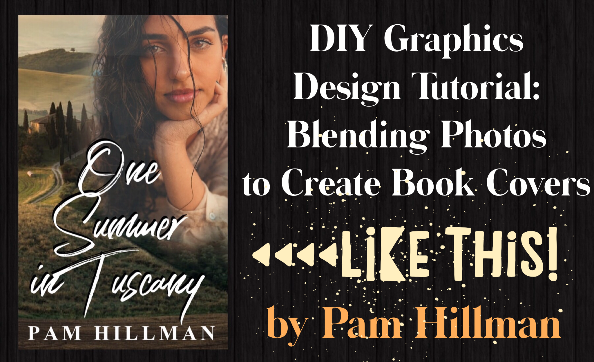
Now on to a cover I created for today's blog post called One Summer in Tuscany. When I realized I didn't have very much step-by-step screenshots to show how to create the above cover, I went to Unsplash and started looking for a landscape that I liked. Any landscape would do, since I didn't have a story idea slot to fill. My "mock" cover could be anything I wanted. If that seems backwards, it is. So, if you're thinking you need something VERY specific for the story you've already written, then read Part I of this blog series. In Part I, I cover how important it is to search for and save photo ideas for future projects.
So, let's pretend I'm writing a book set in Tuscany. :)
First, I found the beautiful Tuscany landscape below and could just picture it was working for a book cover. Then I searched for couples, but didn't find anything that jumped out at me. Ideally, I was looking for a couple or a woman outdoors and with a muted background that would work well with the landscape. I found the blonde woman wearing the hat, but she didn't really work for the look I wanted, even though the muted background would make working with her image fairly easy. I kept looking and found the beautiful woman with dark hair. The background was going to be a bit harder to work with, but the look of the woman fit the Tuscany landscape SO much better, and I was excited to work on the project.
 |
| Unedited Photos Downloaded from Unsplash |
Originally, I planned to create a cover on the same lines as the Western-style cover above (titled When Comes the Spring for lack of a more appropriate title): a landscape on the bottom with the woman on the top half, separated by a banner of some sort. But as soon as I uploaded the Tuscany landscape to PicMonkey, my plans changed. I could see that this cover idea could be so much more...
 |
| Screenshot #1 |
Screenshot #1, above, shows the landscape image uploaded to my book cover template (templates are covered in Part II of this blog series), cropped to the size I wanted for the cover, then FLATTENED. Flattened anchors or "glues" (like that mod podge we talked about) that image as the background. It's your first layer. You don't have to do this step, but it helps if you're pretty sure you've got that layer just as you want it.
 |
| Screenshot #2 |
Also, I'm explaining ALL about erasing, but wait until the end when I share the cool new website I just learned after I did all this work. :)
 |
| Screenshot #3 |
When you click on any layer/image in Picmonkey, a toolbox called IMAGE appears on the screen. To erase parts of the image, choose erase and adjust the parameters to fit your needs. I wanted to erase all the hard edges around the photo, as well as ALL of the background around her.
 |
| Screenshot #4 |
As a matter of fact, when I started, I planned to just keep her face, but she looked really funny with that hand on her chin. lol (And I liked her longer hair). Also, the "dangling" hand as well as her left arm with the wet shirt-sleeve looked totally out of place. Erase. Erase. I just slowly edited out until I hit just the right balance.
 |
| Screenshot #5 |
With a few more tweaks, I knew I was really close to a decent mix of these two photos that (to me) would make a gorgeous cover. Screenshot #5, above, is the landscape background and the cover model with NO filters applied to either.
Now, let's play with filters. Sometimes, an author (or her editorial team), will decide to fade the model (or some other portion of a cover) for whatever reason. It might be a play on something in the novel... say, the heroine has amnesia and her memory is foggy. Or the title was something like "When Love Fades" or "Memories of You". You get the drift. To achieve these effects, use the Image Tool and play with the BLEND MODES. Screenshot #6 shows the results of using the SCREEN mode. Screen mode achieves a slightly different effect than just FADING, which is also an option on the Image tool. The more you play with Blend Modes, the more uses you'll find for each and learn the best times to employ them on different projects.
 |
| Screenshot #6, "Tuscany Screen" |
 |
| Screenshot #5 again. NO filters applied. I called this "Tuscany Normal" |
At this point, I was very happy with Screenshot #5, aka "Tuscany Normal", and after I let the images settle, if I was truly ready to publish this book, with this title, I'd probably go with that nice, sharp image above.
 |
| "Tuscany Faded" |
But sometimes you have to play with the options to see what works and what doesn't. The photo of the girl above is faded just a tiny bit from Tuscany Normal. Just enough to let a tiny bit of the background to show through. If you look closely, you can see it in the duller look of her lips, and the way the horizon cuts through her hair toward her eyes. Using fade works in some situations and not in others. It's just a matter of preference.
 |
| Tuscany Screen |
Here's Tuscany Screen again with the actual filter applied, which shows a LOT of blending of the model into the background. It's not a technique I'd use on a cover unless I had a really good reason.
 |
| Tuscany Smudge |
Oh, and BIG TIP. For Tuscany Smudge above, I FLATTENED both the landscape background and the cover model before I applied the Smudge filter. Otherwise, the filter would have only been applied to whichever image (layer) I'd selected. And, it's possible to apply different filters to different layers if you find you need to do that. Just know as you're working which layer you're working on and/or if the layers have been flattened first. (Sorry, that's getting a bit complicated, and I promised to keep it simple. :)
 |
| One Summer in Tuscany MOCK Cover |
Tada! We have a cover. I used Tuscany Faded to create this cover, but again, if I really had a novel set in Tuscany, I'd probably go with the original no-filtered photo of the model.
>>>>> www.remove.bg <<<<<
"Download" is free. "Download HD" will accrue a charge. I used Download for the following image.
 |
| Tuscany model with background removed using remove.bg |
Okay, I think I've covered everything, and since it's nearly midnight and I'm out of time, we're going LIVE! Hope y'all enjoyed today's post and learned more tricks and techniques to create amazing graphics, whether for book covers, memes, or even t-shirts for your next family reunion.

I am dizzy with knowledge, but you amaze me, Pammers!
ReplyDeleteI confess to being image stupid. I know my weak spots. But you make this look doable even for someone like me. And that's a huge compliment because I understood the process... kudos on being this clever and able to explain it all. What a great series!
Ruthy, you're SO amazing at so many things (like baking, FUDGE!!!, writing books, advocating for your friends and family!). I'm constantly amazed at all you do and accomplish before I even wake up every day!
DeleteI think you can be forgiven for not having an eye for digital design. :)
Thank you, Pam, this is fascinating! I love all of the info that you're sharing!
ReplyDeleteThank you, Connie. Glad you're enjoying this series.
DeletePam, this is great! Thank you so much for the tutorial!
ReplyDeleteI'm going to have to take a day and fool around with this process just to become familiar with it. Wouldn't it be fun to use my profile picture and place me in an exotic location?
But someday, I hope to use these skills to design my own covers. If I can do half as well as you have, the covers will look very professional!
What a neat idea to use your profile pic in an exotic location. :)
DeletePam, this is amazing! First, I didn't realize you've done an entire series on graphics. I'm definitely planning to go back and read. I appreciate the step-by-step guide, as well as the screen shots. you make me think even I could do this. :)
ReplyDeleteThank you, Jeanne! I did a couple of posts on Picmonkey and Wordswag (years ago) and covered way too much in each post. This time I decided to do the series and make each post very specific to parts of design. Bite size!
DeleteThis is so informative and I love seeing your process!
ReplyDeleteThanks, Erica! Glad you're enjoying the posts.
DeleteWow, Pam! I'm totally impressed!! I'm printing out your post so I can give this a try. I'm pretty slow though when it comes to graphics, but I'm going to give it a whirl. Thanks for the info!
ReplyDeleteGlad you stopped by, Barbara. And you'll do fine. Have fun! That's the important part. :)
DeleteThis comment has been removed by a blog administrator.
ReplyDelete