Good Monday morning, Seekerville! I (Carrie) am here to introduce today's guest for this month's 'One Thing That Works For Me' series. Please join me in welcoming author and professional cover designer Hannah Linder to share what works for her when narrowing down the elements for a book cover.
~*~*~*~
Narrowing Down What Should (Or Should Not) Stay on a Book Cover
Ms. Example Author has just typed the end on her baby. Her book baby. She’s cried over the manuscript, prayed over it, worked through a thousand kinks—and she’s finally ready to deliver this infant into the world of publishing. This brings her to a crucial stage: the book cover design. What should go on the cover? Which themes, characters, settings, or struggles are vital enough that they should be represented in the design?
So, with enthusiasm and lots of squeals, Ms. Example Author hurries to her keyboard and types her designer this e-mail: “I would like my middle-aged, purple-haired, thin-faced heroine (who also walks with crutches and usually wears a leather jacket) standing outside of her yellow duplex with her curly-haired, next-door neighbor reaching for her hand, a tabby cat sitting in the window, and a red package sticking out of the tin mailbox. And oh yeah, can we add a graveyard in there too? That’s an important part of the story, so we must get that in there somewhere!"
As you might agree, this request already has our brains hurting. Just imagine smashing all this into a book cover! So, how do we proceed with this? How can you, as the designer or the author, help narrow down the basics to portray the most important aspects of your book without overloading the design?
Here’s a quick method that works for me. Let’s run through the questions!
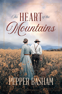
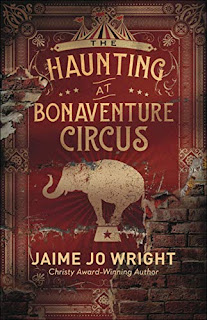
- What is the genre? A big determining factor on how much, or how little, should go on your cover should be decided after perusing other books in your genre. Nonfiction? Let’s go as simple as possible. Less is more. Historical fiction? We can probably establish the main character, setting, and emotion—and throw in some embellishments too. So do some research and determine what does or doesn’t align with your genre’s current trends.
- What is the theme? Surprisingly enough, this is a question for both nonfiction and fiction titles. Granted, it may be more important in deciding for a nonfiction book—because hey, if the recurring theme is beauty from brokenness, let’s throw in something like a flower growing from cracked pavement, right? But the theme of your novel can be helpful to evaluate too. For example, if your protagonist must learn to forgive his father, whose dog tags he wears about his neck, that gives us a starting place. Should said protagonist be on the cover? Should the dog tags, which we’ve now established are an important aspect of the story, be hanging about his neck? If nothing else, knowing your book’s theme will help you identify the emotion your book cover should illuminate.
- What is most important? This can be a hard one because running back to our Ms. Example Author, she might argue that all the things she mentioned in her e-mail were an important part of the story. But let’s narrow it down. Who is the main character? What is the central plot of the story? What is the main setting? What scene or visual would best pull the viewer into your world—and how can you represent that scene or visual in the simplest way?
- What is the takeaway? When you present a potential reader with a book cover, you are giving them one glimpse into the world of your book. Sometimes you’ve only got a second before they scroll on, pass to the next shelf, or slide your book back into another stack. So, you need to determine now what the takeaway of your cover should be. Will it promise suspense? Romance? History? A great psychological truth? If you’re throwing too much at the viewer in one book cover, they’ll walk away feeling a little unsure and without that solid impression they need. Make sure the aura, the feel, of your story is going to come out strong in your cover.
In conclusion, I defer again to the saying, “Less is more.” Be consistent with your genre, stay in mood with your theme, highlight the most important aspect of your story, and make sure the end result is strong enough to lure readers into your pages and leave an impression. I hope you find this process helpful in deciding what should stay (or not stay) on your book cover. Good luck!
~*~*~*~*~
Hannah Linder, represented by Books & Such Literary Management, is a Christian fiction author residing in the beautiful mountains of central West Virginia. Her upcoming Regency romantic suspense novel, Beneath His Silence, will be releasing with Barbour Publishing in November of 2022. She is a two-time 2021 Selah Award winner, a 2022 Selah Award finalist, and an ACFW member. Follow her journey at www.hannahlinderbooks.com.
Also, Hannah is a magna cum laude Graphic Design Associates Degree graduate who specializes in professional book cover design with affordable prices. Having designed for both traditional publishing houses and award-winning authors, Hannah understands the importance of an attractive book cover and the trends of today’s industry. Her clients have included New York Times, USA Today, and International bestselling authors. Find out more at www.hannahlinderdesigns.com.
Readers, what attracts you to a book cover?


Hannah, it's so nice to hear from you again. I love the beauty of book covers and I agree: less is more. And huge thanks for using my Peace in the Valley cover here... I love the job that Waterbrook did with the covers on that series, making the heroes the focal points. And then they did a 100% marketing about-face when the books weren't selling like they should, they brainstormed one night and decided to put the books out again, a re-release, in mass market paperback format and stocked them in the places where my Love Inspired books were sold. That was a game-changer. Great covers, narrowly focused on the heart of the matter, and showing in the right place.
ReplyDeleteYou have such a good take on all of this, Hannah. Thank you!
She's so smart, isn't she?
DeleteThat’s awesome, Ruth! Although I love heroines on covers too, I’m a sucker for covers with the hero. 😉
DeleteThank you so much for your great insight, Hannah!!
ReplyDeleteI’m glad to be here today, Carrie! Thanks so much for having me! 🥰
DeleteHannah, thanks for being with us today and for sharing your expertise! Great information! I loved the covers you showcased, as well!
ReplyDeleteI’m glad to be here, Debby! I’m so glad to hear you enjoyed the post! ❤️
DeleteHi, Hannah! I know we're not supposed to judge a book by its cover, but I do. I love a cover that captures the atmosphere of the story, through color and shadow and font.
ReplyDeleteSo very, very well said, Erica! I think the quality of the cover is a reflection on the quality of the book.
DeleteAlso, look who is commenting without difficulty now, haha! 😂
Thanks for the interesting post, Hannah. I work in a bookstore, so I look at covers all day long at work. I really do judge a book by its cover.
ReplyDeleteI’m glad you enjoyed the post, Sandy! How fun to work in a bookstore! And I definitely judge books by their covers as well. 😁
DeleteAs a reader I can usually pick up a book and decide by the cover if I will want to read it. I guess I judge a book by its cover.
ReplyDeleteColors, people, and the font style draws me to books. I wish I worked in a bookstore, although I probably wouldn't have a paycheck! ;)
ReplyDeleteThe cover is usually the first thing I notice about a book, and it has to draw me in for me to want to read the book. I agree with "less is more." I'm drawn to simple, non-cluttered covers. Thanks for this thoughtful, intriguing post.
ReplyDelete